×
![Modal Image]()

One of the most rewarding moments came when Aura began responding to narration. Audio levels were sampled, normalized, and smoothed, then mapped to multiple visual properties. As Aura spoke, its membrane expanded, the glow changed, and the motion accelerated. That was the moment the glowing sphere stopped being a visualizer and became a presence.
Part 1 was the product story. Part 2 covered the engineering realities of building for spatial computing: going native, performance, interaction, comfort, and real-world testing. This last part goes inside 4 systems. Aura made guidance feel alive. The Waterfall made hundreds of artworks feel effortless to explore. The Banksy teleportation experience used Gaussian Splats to rebuild a place. The Palm Favorites Carousel turned noisy hand tracking into an interaction you can trust.
At Amplified we treat these as 1 family rather than 4 features, because they solved different problems the same way: by making the technology invisible enough that the person could look at the art.
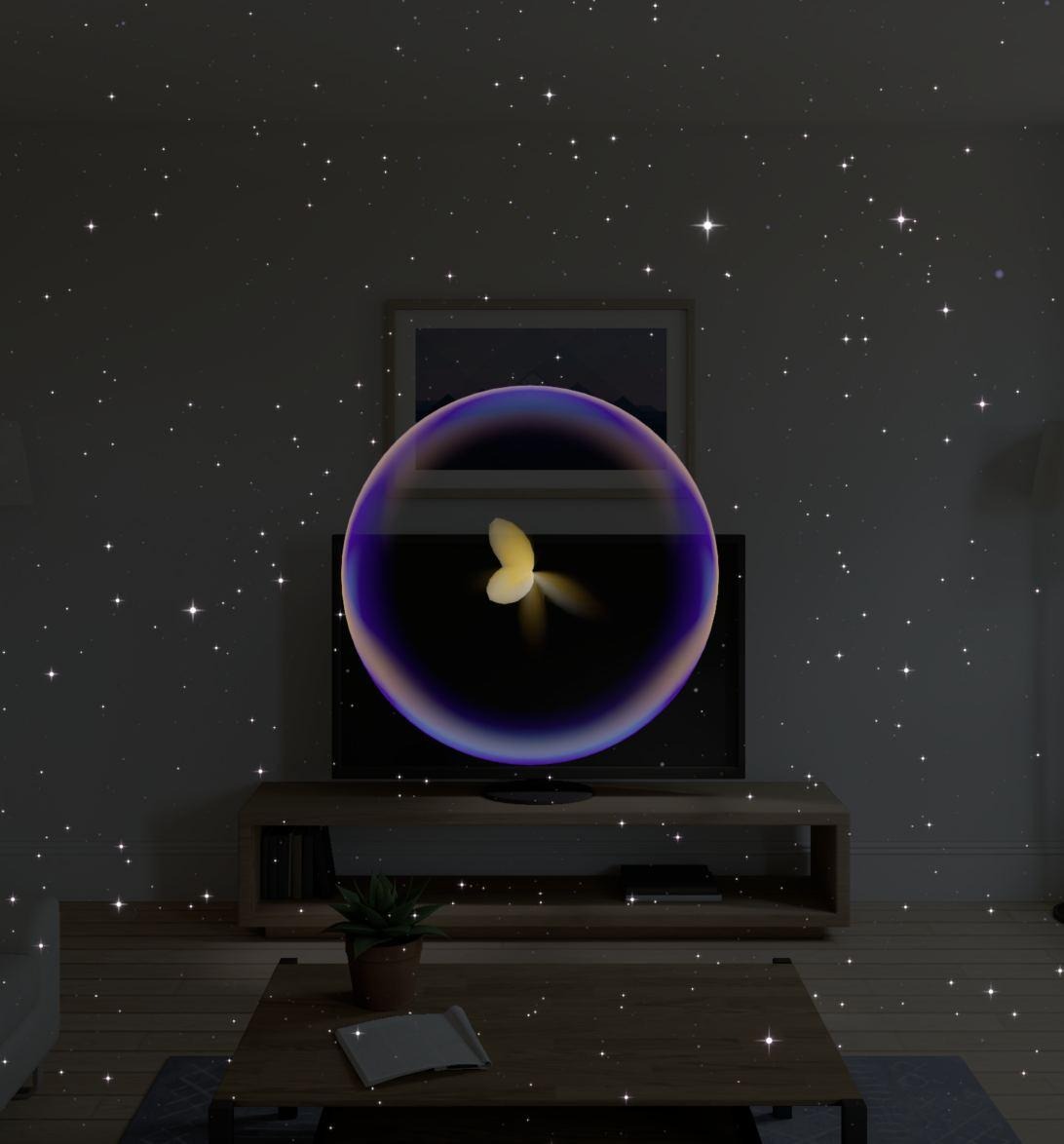
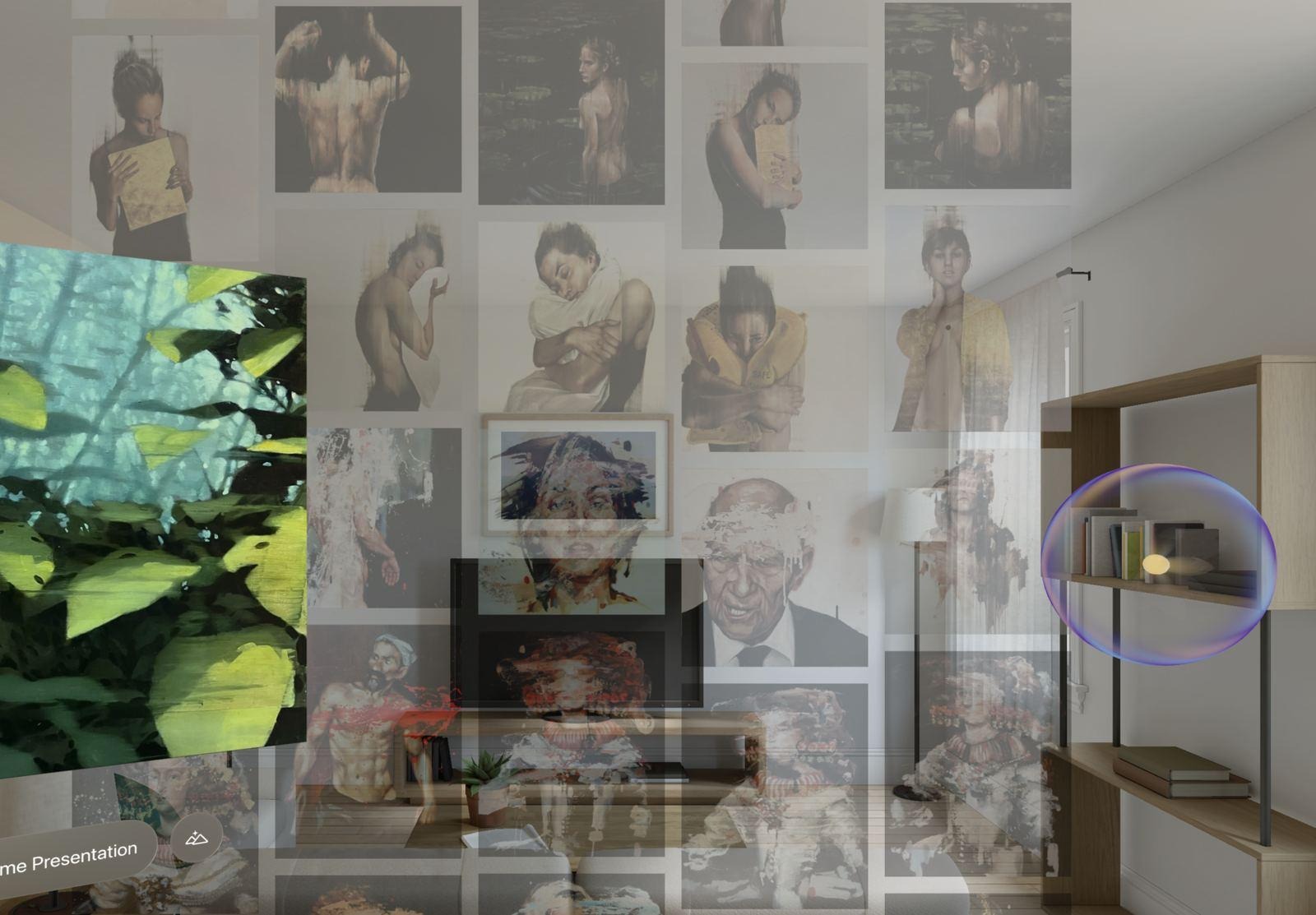
Most apps guide people with menus, buttons, and navigation panels. Art Universe was designed around exploration and storytelling rather than catalog navigation, so we wanted guidance that lived inside the experience. Aura is the result: a digital companion that narrates, guides, anchors the space, and reacts.
What people see is a glowing sphere. What runs underneath is 1 of the most involved real-time systems in the app. The hard part wasn’t drawing the sphere. It was making it feel alive: responding continuously to narration, touch, scene transitions, the person’s presence, and app state, with a consistent personality throughout. Any delay or hitch breaks the illusion at once.
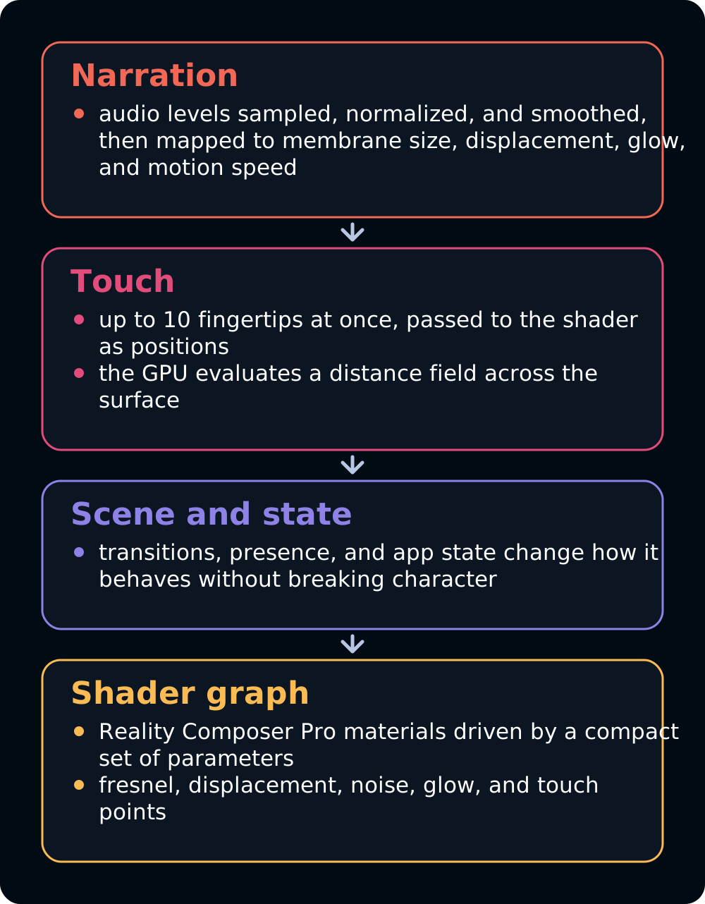
Aura’s look is generated procedurally through shader graph materials built in Reality Composer Pro. Instead of pre-rendered effects or textures, the system drives a small set of parameters, fresnel intensity, displacement strength, animation speed, noise, glow, and touch deformation points, and the GPU does the visual work. The surface is never still, without placing unnecessary pressure on the CPU.
The narration link is the part from the opening. We never wanted people to only hear a voice. We wanted them to see it. Audio levels are continuously sampled, normalized, and smoothed, then mapped to several visual properties at once, so as Aura speaks, the membrane expands, the glow changes, and the motion picks up.
Touch added another layer. Aura responds to up to 10 fingertips at once through Vision Pro’s hand tracking. Rather than computing the deformation on the CPU, the app passes fingertip positions into the shader and the GPU evaluates a continuous distance field across the surface. People feel ripples and depressions that seem physically connected to their touch, and the architecture stays cheap.
Nobody who uses Art Universe describes the shaders or the audio pipeline. They say Aura feels alive, which is the only review of that system we wanted.
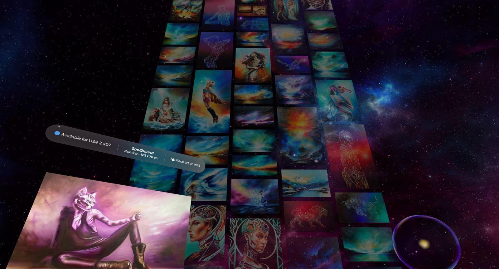
If Aura is about presence, the Waterfall is about scale. 1 of our earliest questions was how to show hundreds of artworks in a room without overwhelming anyone. Grids, menus, filters, and infinite scroll work, and they also turn discovery into administration. We wanted browsing to feel like wandering through a world of art rather than paging through a database.
The Waterfall is a continuous stream of artworks flowing through space. Even when the person does nothing, the environment moves. Art drifts around them and invites exploration without demanding it.
Getting that feeling meant solving a rendering problem first. A catalog can hold hundreds or thousands of pieces, and drawing all of them at once would waste memory and processing. So the Waterfall recycles. Only the artworks inside an active viewport exist at any moment. As pieces leave the visible area they’re removed and reused while new content enters, so the wall looks endless while the renderer’s workload stays almost constant.
Then there’s the layout. Artworks arrive in every proportion, some very tall, some very wide. A conventional grid would waste space or crop the work, so the Waterfall uses a masonry-style layout that adapts continuously to each piece’s dimensions and packs them into arrangements that feel curated rather than mechanical.
Movement needed restraint. 1 of the most common mistakes in spatial computing is assuming motion improves immersion. Too much of it is distracting, so the Waterfall moves slowly and deliberately, through long-duration transforms rather than constantly updating animation loops. Atmosphere, not spectacle.
The most interesting problem was hiding the machinery. Pieces are constantly created, removed, repositioned, and recycled. Occlusion zones above and below the visible area let us prepare a piece before it enters view, so the transitions never show. The best compliment the Waterfall gets is that nobody wonders how it works. They keep exploring.
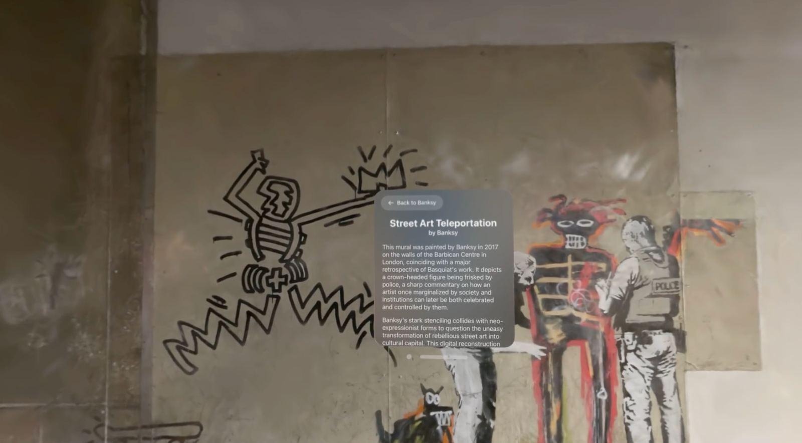
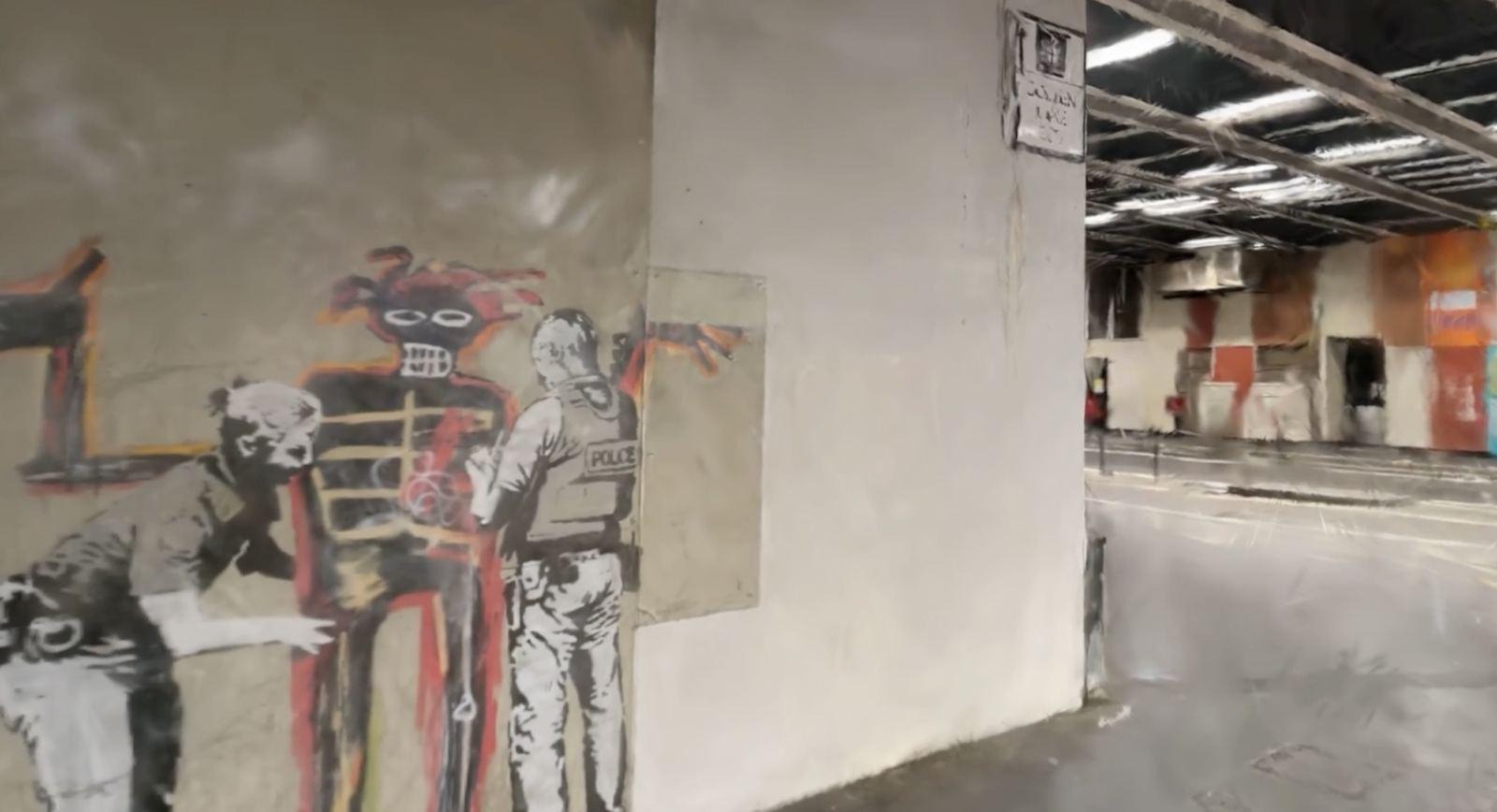
We wanted Art Universe to go beyond showing artwork and start rebuilding the environments where artwork lives. Street art was the obvious case. A mural is shaped by the wall it’s on: the architecture around it, the texture of the surface, the weathering, the imperfections. Photographs capture fragments of that. They rarely capture the feeling of standing there.
So instead of showing people a location, we tried to take them to it. That pushed us into the most technically ambitious work in the app. Mesh-based 3D pipelines couldn’t reproduce the surface variation, the subtle lighting, or the weathered detail that make a real place convincing. Gaussian Splats could. Rather than rebuilding a scene from polygons, splats represent it through millions of radiance samples, and they preserve visual richness that meshes struggle to match.
That realism cost us RealityKit’s standard pipeline. We built a custom architecture around Metal, Compositor Services, and dedicated rendering systems, which meant taking over responsibilities RealityKit normally handles for free: asset management, rendering control, lifecycle, and performance.
Comfort mattered as much as fidelity. The fastest way to ruin an immersive experience is artificial locomotion, where what you see moving disagrees with what your body feels. So reconstructed scenes stay anchored in physical space. Device tracking updates the view and projection matrices continuously, and people explore by moving their head and body, with depth and parallax intact.
The assets are enormous, because that’s what makes them good. Downloading, decompressing, parsing, and preparing them takes time, so we treated loading as part of the experience: continuous feedback, and placeholder content that keeps the environment feeling alive while the real one is prepared. Caching became essential. Once a reconstruction has been prepared, the renderer keeps a reusable state so the next visit is immediate.
What people remember is standing inside a place. Not the rendering architecture, which is how it should be.
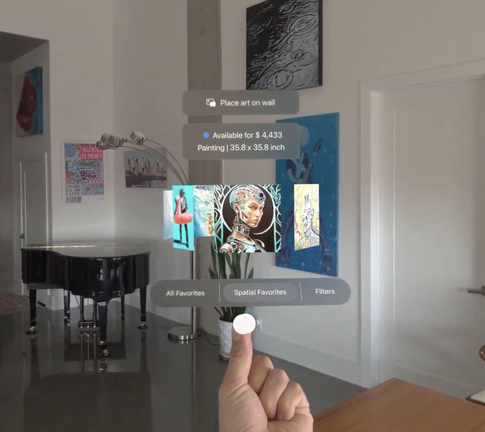
If the Banksy experience pushed our rendering, the carousel pushed our understanding of hands. The question that started it was simple: if spatial computing frees software from menus, why should your saved artworks still live in 1?
The answer is an interaction. Raise a hand and a circular collection of your favorites floats above the palm. Rotate through it with the other hand, pick a piece, and place it in the room. People got it almost immediately, and building it turned out to be one of the hardest interaction problems on the project.
Vision Pro’s hand tracking is remarkable, and raw tracking data is only the start. Hands are noisy. Small tremors, involuntary movements, and tracking fluctuations that go unnoticed all day become obvious the moment virtual content is attached to them. Our early versions worked in every technical sense and felt wrong in every human sense: small movements produced exaggerated reactions, rotations felt nervous, and the whole thing had no weight.
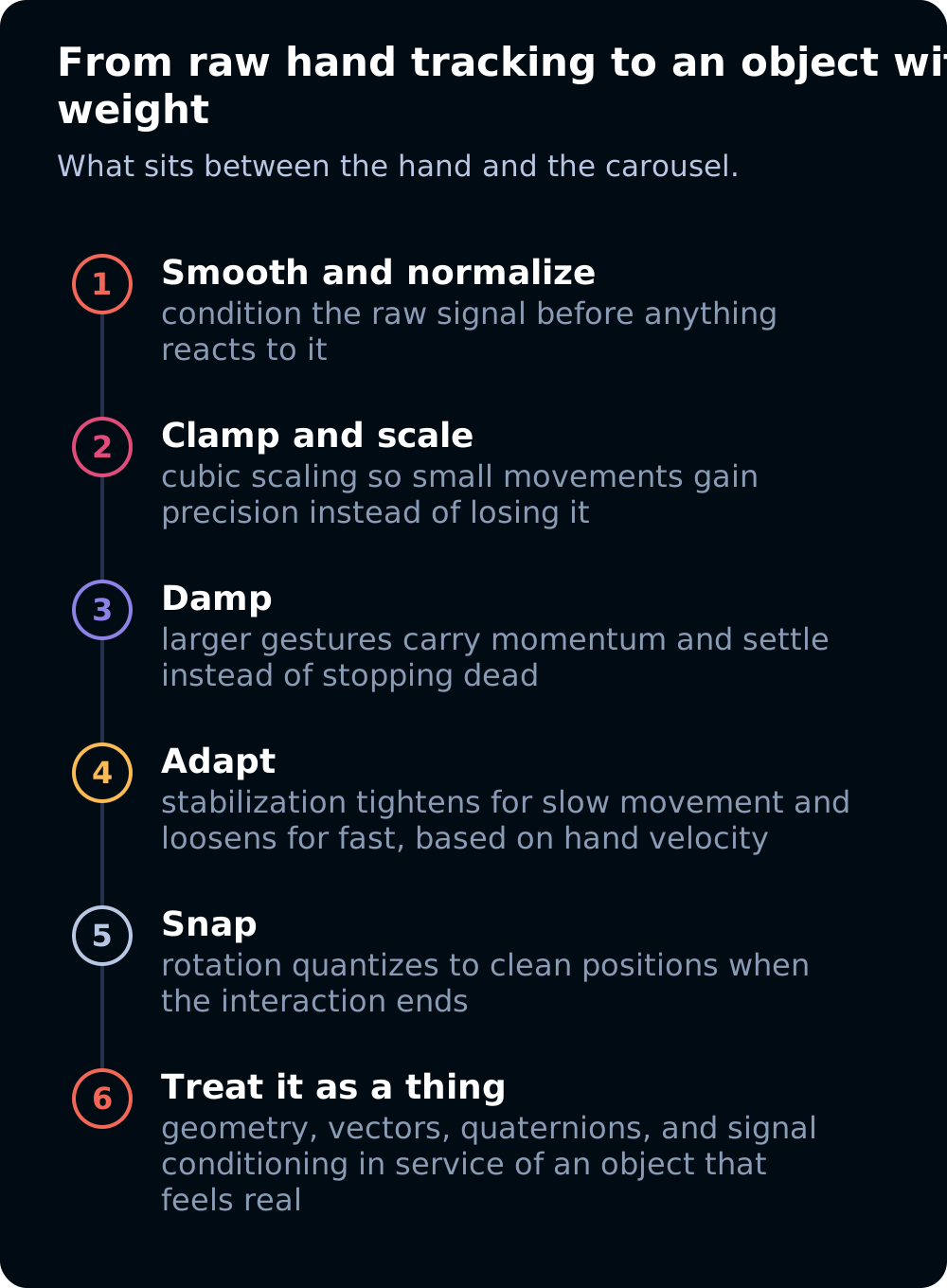
The breakthrough came when we stopped treating the carousel like an interface and started treating it like a physical object. Instead of mapping hand movement straight to rotation, we added smoothing, normalization, clamping, cubic scaling, damping, and adaptive stabilization. Small movements gained precision. Larger gestures generated momentum that settled naturally. The carousel got weight, and the weight is what made it feel right.
Snapping mattered too. Without it, artworks stopped at arbitrary angles and the ring looked cluttered, so rotation quantizes to clean positions whenever an interaction ends. People don’t notice the help. They notice its absence.
Jitter was the last fight. A fixed amount of stabilization was never right, because slow movements want heavy smoothing and fast ones want immediacy. The solution adapts continuously to hand velocity, and it took more experimentation with hand-tracking behavior than any of us expected.
People see none of that. They raise a hand and browse. In a lot of ways the carousel is what spatial computing promised: an interaction designed for a room rather than an existing interface rebuilt in 3D.
Aura, the Waterfall, the Banksy experience, and the carousel solved 4 different problems and reached the same conclusion. Spatial computing works when complex systems become simple to experience. Nobody should have to think about how a guide responds to touch, how hundreds of artworks are recycled behind the scenes, how millions of radiance samples become a place, or how a shaking hand becomes a steady interaction.
That principle decided most of the hard calls on Art Universe. The aim throughout was to let the technology support discovery, learning, and an emotional connection with the art, and to keep it from becoming the show. When it works, people remember the artists, the places, and the work itself, and the engineering fades into the background because it has done its job.
At Amplified that’s still the standard we hold spatial work to, and it’s why the people who built these systems would rather talk about the art than the shaders. If you want to talk about the shaders anyway, they’re here. Let's build together.