×
![Modal Image]()

The first time one of us put on a Vision Pro was at an Apple Developer Lab. One of our engineers had been building against the simulator, but experiencing the device on real hardware changed the perspective immediately. The display quality, responsiveness, tracking accuracy, and overall coherence of the experience felt unlike anything we had tested before.
That feeling is the reason the Art Universe exists. Apple announced the Vision Pro at WWDC in June 2023, and we saw a device that could put digital art in the same room as the person looking at it. Every digital art experience before that, including the ones we’d built ourselves, ended at a screen.
At Amplified we’d been working on the art and technology problem for years through Kaleido, our platform for artists, collectors, and galleries. Art Universe became the spatial, curated expression of that work: featured by Apple, rated 4.9 stars, and shipped in the first wave of native visionOS apps. This first article is the product story. Part 2 is engineering. Part 3 goes inside 4 of the systems.
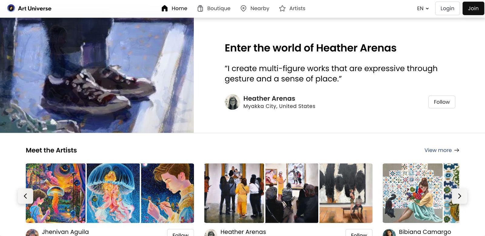
Kaleido taught us the shape of the problem. Artists could show portfolios, collectors could find new work, galleries could reach people they’d never meet in person. Around the platform we ran augmented reality experiments: digital layers over physical pieces, animations, contextual notes that appeared next to a canvas.
Every one of those experiments hit the same wall. However rich the content got, the person was still looking through a phone. The device sat between the viewer and the work, and for a medium built on presence, scale, and atmosphere, that mattered more than any feature we added.
So we didn’t build a Vision Pro version of Kaleido. We built something narrower. Kaleido serves a broad community of creators. Art Universe would carry a curated roster of artists whose work leaned into experiment, and it would try to be the most compelling art experience on the platform rather than the biggest gallery. Internally we called it the crown jewel of the Kaleido family, which tells you how we felt about it.
The first product question was 1 we’d never had to ask on a phone: how much immersion is the right amount?
Vision Pro hands you everything at once. Immersive environments, 3D interfaces, hand tracking, spatial audio, depth, motion, interaction models nobody had settled yet. Our early prototypes reached for all of it. More movement, more effects, more layers.
Then we watched people use them. They noticed the effects. They enjoyed the interactions. And their attention drifted away from the art, which was the one thing the app was for. Immersive and meaningful turned out to be different things.
The artwork had to remain the hero.
That sentence became the rule we tested every feature against. Environments, animations, audio, and spatial effects had to support the work or go. Some parts of Art Universe are deeply immersive. Browsing stays approachable, information stays 1 glance away, and buying a piece favors clarity over novelty, because the goal was never to show what the headset could do. It was to help someone look at a painting for longer.
Building for a platform with no conventions meant we couldn’t read a guideline and trust it. We had to watch. Throughout development we put the headset on people who’d never worn one and paid attention to what they tried before we told them anything.
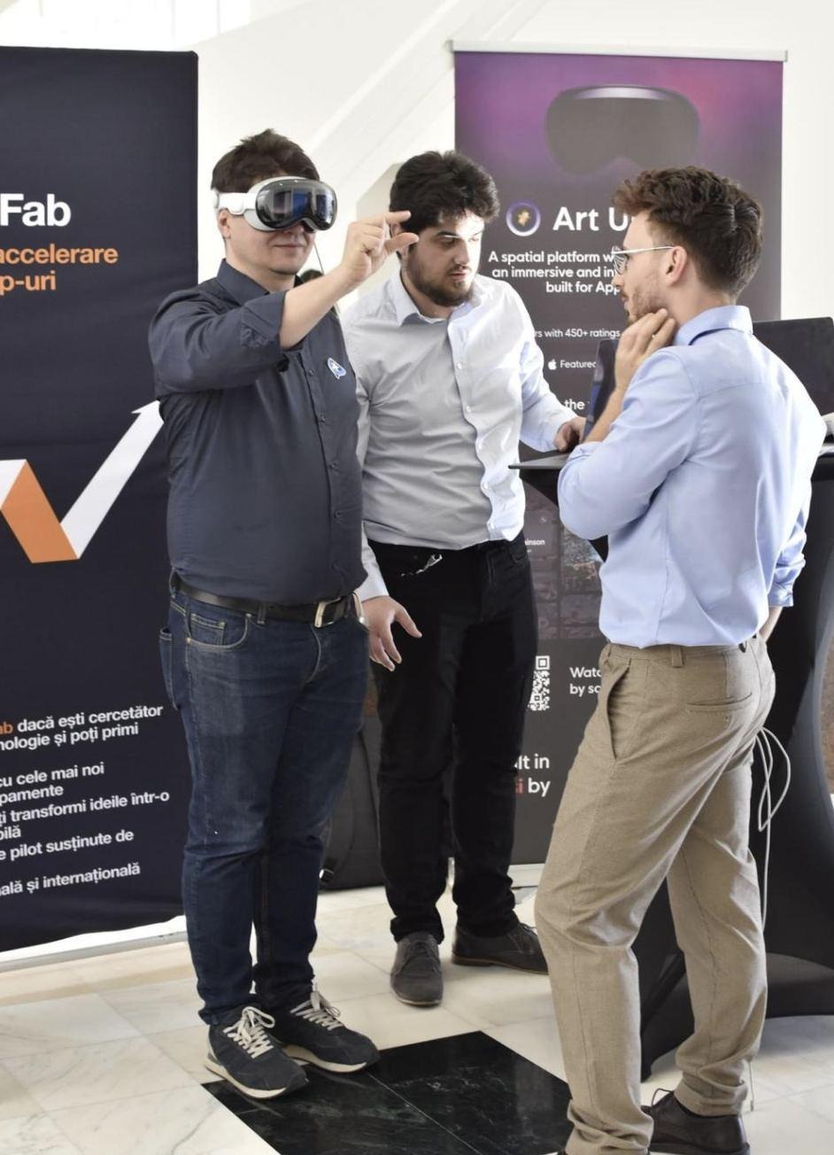
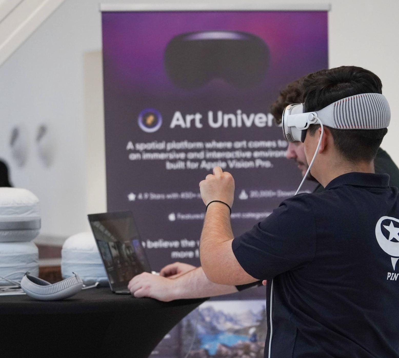
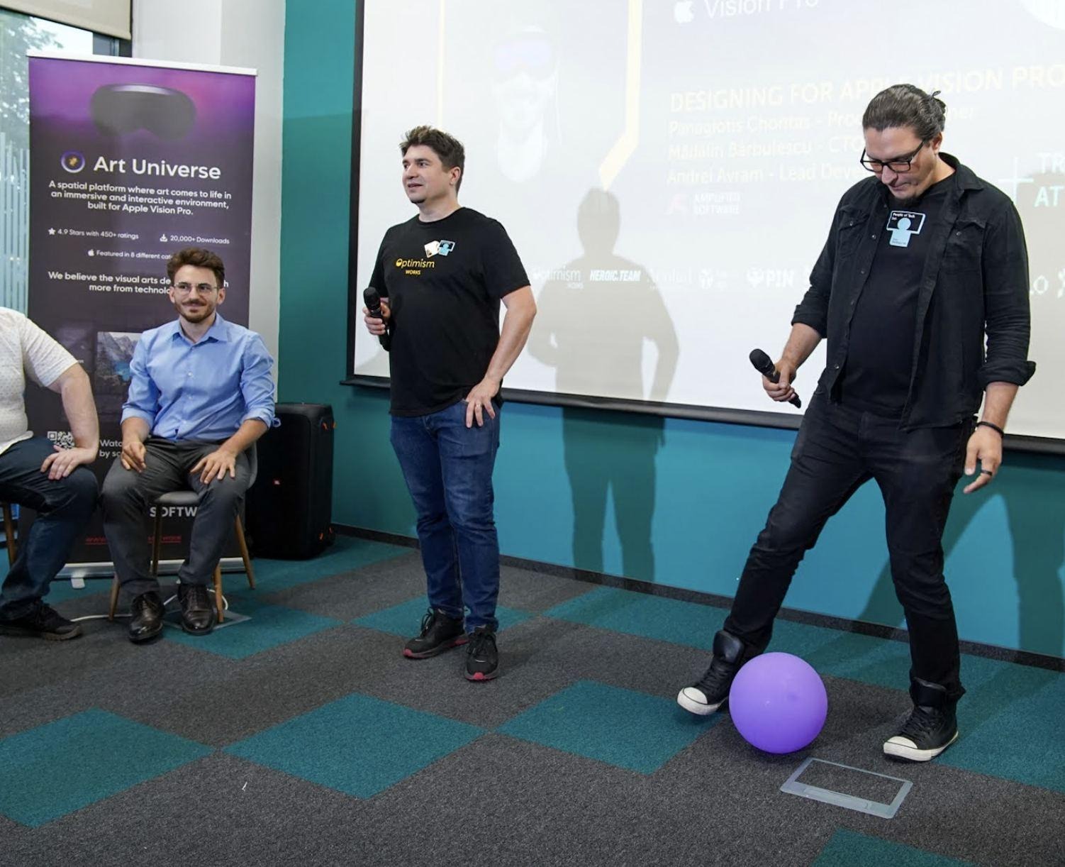
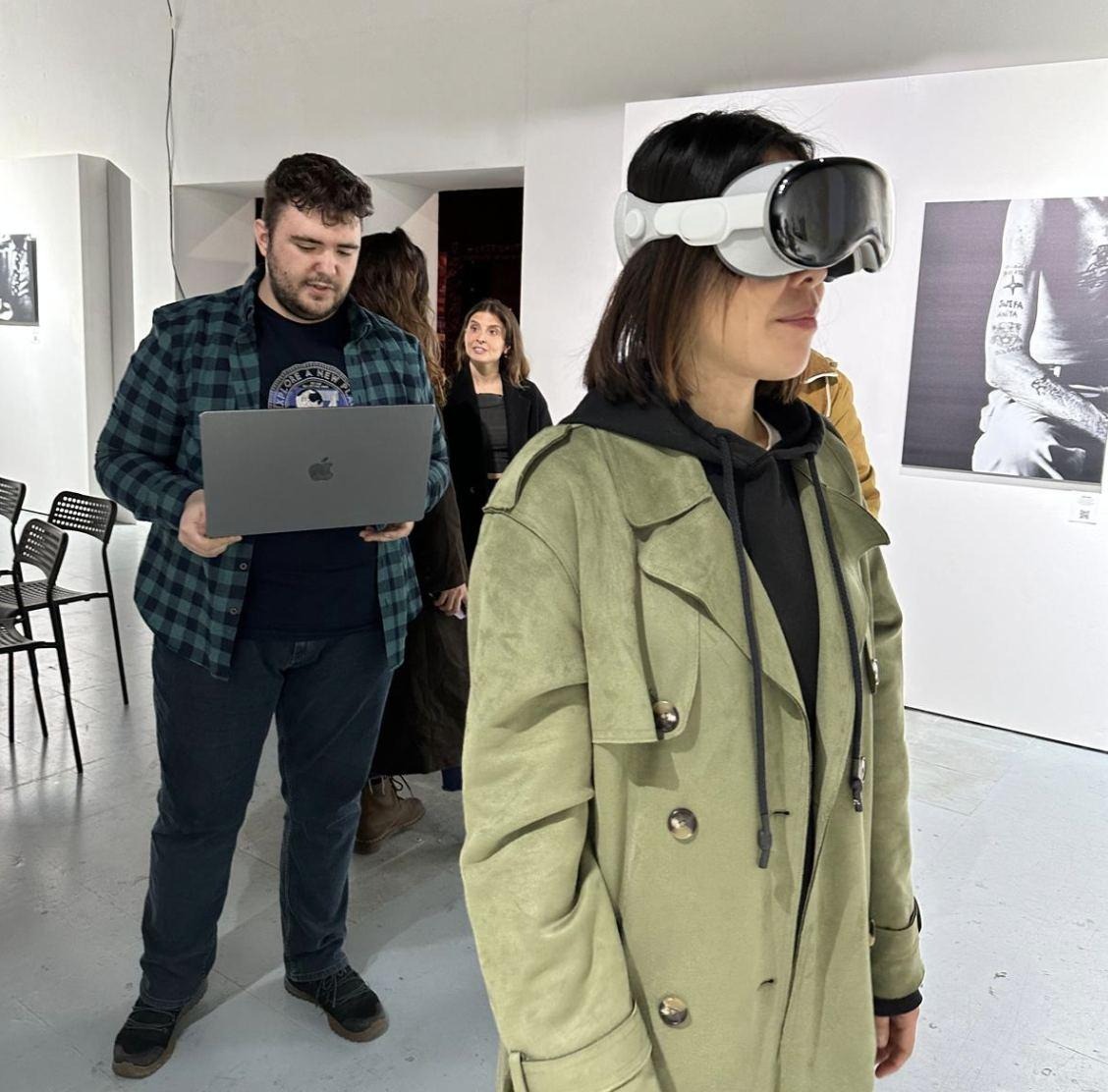
Public demos were where we saw first-time behavior at volume: where people looked first, what they pinched, how long it took them to find the art.
Hands-on sessions outside the studio, with the laptop open beside the headset, were where onboarding, gesture clarity, and comfort got easier to judge than they ever were on our own desks.
Presenting to design and technology audiences told us which ideas carried beyond the team. Some things we’d nearly cut got the reaction we’d hoped the whole app would get.
Gallery sessions, with real walls and real people moving around real work, showed how the experience changed when someone could walk through it.
The clearest lesson came from Art Waterfall, which turned into 1 of the app’s signature experiences. It presents artwork in a cascading spatial arrangement that doesn’t look like a grid, a website, or a phone app. On paper it was a risk: it fit no known convention and we had real doubts anyone would understand it. In practice people explored it without instruction, moved through it as if they’d done it before, and stayed with the work despite the strange format. The experiment became the feature people remembered, and it taught us that users on a new platform will show you interaction patterns you didn’t plan for, if you let them.
As the app matured, it became a set of experiences that each used space for a reason. People browse through spatial layouts, get context from Aura, the AI-powered guide, walk around interactive sculptures, and read about the artists behind the work. They can step into environments built around a specific artistic story. Street art features teleport them to the real-world location of a mural, and collectors can hang a piece on their own wall at true scale before they buy.
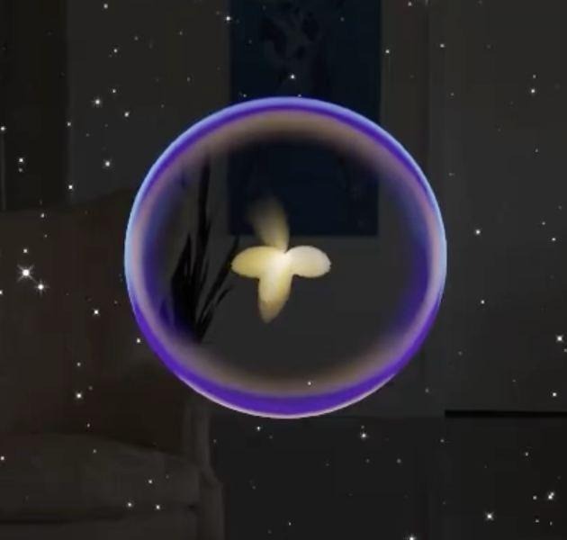
Aura is the one visitors ask about first. It’s a glowing sphere that narrates, points, and reacts, and it was designed so that guidance lives inside the experience instead of in a menu. Part 3 covers what it took to make it feel alive.
Hanging art at true scale is the one collectors ask about. If you’ve bought a piece from a website, you know the problem: a photo and a pair of dimensions never tell you how it will feel on your wall. Art Universe turns that guess into a look. You pick the work, place it, and step back. The technology underneath is considerable, and Part 2 gets into it, but the value is plain. It solves a problem people have had for as long as art has been sold.
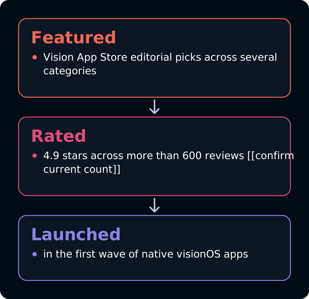
What the Vision App Store says
That became the pattern across the app. The strongest experiences shared a trait: the technology quietly made something possible that a screen never could, and then stayed out of the way.
Over the course of development, members of the team attended Apple Developer Labs in Singapore, Munich, London, and Cupertino. The labs gave us access to real hardware when Vision Pro was still hard to get near, and direct feedback from Apple’s engineers, designers, and developer relations people on prototypes that had only ever run in the simulator.
A lot of the final experience was shaped in those rooms. Objects that looked correctly sized on a monitor felt too large in the headset. Distances needed adjusting. Gestures needed refining. Features we’d considered finished changed once we experienced them in space.
And the first hands-on session, the one this article opened with, did something the labs’ feedback couldn’t. The display, the responsiveness of the interaction model, the tracking, the coherence of the whole thing felt less like an iteration of what we’d used before and more like a beginning. We came out of that room certain Art Universe was worth the effort.
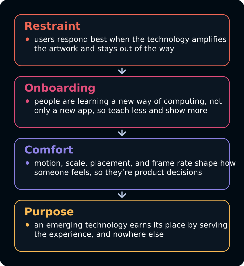
4 lessons from shipping Art Universe
Spatial UX rewards restraint. Onboarding matters more than you expect, because your user is learning a new way of computing at the same time as your app. Performance and comfort aren’t engineering concerns you can defer, because motion, scale, placement, and frame rate change how a person feels inside the experience.
And the belief underneath all of it, which we still hold: emerging technologies create value only when they serve a meaningful experience. Art Universe took product thinking, design discipline, technical experiment, artistic sensitivity, and a close working relationship with artists and with Apple. There was no playbook. That was the point.
By launch, most of the product questions had answers. We knew how people wanted to experience art in a room and what technology’s role in that should be. Behind every one of those answers, though, sat a harder engineering problem: high-fidelity artwork rendered efficiently, complex 3D assets that had to perform on a wearable, interfaces that had to feel natural while staying stable.
At Amplified that’s the part we like most, and it’s the subject of Part 2.
If you’re building for Vision Pro, we’d like to hear what you’re making. Let's build together.